Overview
Dash is a great tool used by many for data analysis, data exploration, visualization, modelling, instrument control, and reporting.
The following example demonstrates a highly reactive and customised Dash app with little code.
Running your Notebook Server and accessing the port
When running any tool from your Jupyter Notebook that posts a website to a port,
you will not be able to simply access it from http://localhost:5000/ as
normally suggested in the output upon running the web-app.
To access the web server you will need to use the base URL. In your notebook terminal run:
Data Visualization with Dash
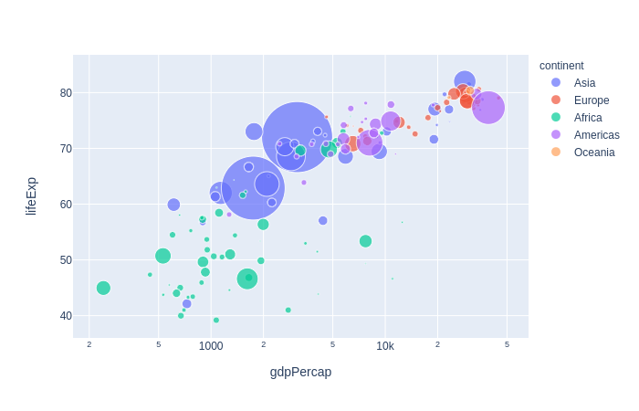
Dash makes it simple to build an interactive GUI around your data analysis code. This is an example of a Layout With Figure and Slider from Dash.
Plotly Dash
Publish with Canadian-made software.
Plotly Dash is a popular Python library that allows you to create interactive web-based visualizations and dashboards with ease. Developed by the Montreal-based company Plotly, Dash has gained a reputation for being a powerful and flexible tool for building custom data science graphics. With Dash, you can create everything from simple line charts to complex, multi-page dashboards with interactive widgets and controls. Because it's built on open source technologies like Flask, React, and Plotly.js, Dash is highly customizable and can be easily integrated with other data science tools and workflows. Whether you're a data scientist, analyst, or developer, Dash can help you create engaging and informative visualizations that bring your data to life.
Getting Started
Open a terminal window in your Jupyter notebook and run the following commands:
Create a file called app.py with the following content:
# app.py

#!/usr/bin/env python3

import dash
import dash_core_components as dcc
import dash_html_components as html
from dash.dependencies import Input, Output
import plotly.express as px

import pandas as pd

df = pd.read_csv('https://raw.githubusercontent.com/plotly/datasets/master/gapminderDataFiveYear.csv')

external_stylesheets = ['https://codepen.io/chriddyp/pen/bWLwgP.css']

app = dash.Dash(__name__, external_stylesheets=external_stylesheets)

app.layout = html.Div([
    dcc.Graph(id='graph-with-slider'),
    dcc.Slider(
        id='year-slider',
        min=df['year'].min(),
        max=df['year'].max(),
        value=df['year'].min(),
        marks={str(year): str(year) for year in df['year'].unique()},
        step=None
    )
])

@app.callback(
    Output('graph-with-slider', 'figure'),
    [Input('year-slider', 'value')])
def update_figure(selected_year):
    filtered_df = df[df.year == selected_year]

    fig = px.scatter(filtered_df, x="gdpPercap", y="lifeExp",
                     size="pop", color="continent", hover_name="country",
                     log_x=True, size_max=55)

    fig.update_layout(transition_duration=500)

    return fig

if __name__ == '__main__':
    app.run_server(debug=True)